A great thumbnail can be the difference between a video that gets noticed and one that gets lost in the crowd. However, creating thumbnails that stand out isn’t just about slapping on some random images and text. There are several common mistakes that even experienced YouTubers make when designing thumbnails. In this post, we’ll highlight these mistakes and show you how to avoid them, so you can create thumbnails that increase your video views.
Overcrowding the Thumbnail
While it’s tempting to put everything you can into a thumbnail, overcrowding can have the opposite effect. Too much text, too many images, or a cluttered design will overwhelm viewers. Keep your thumbnail simple and focused.
- Solution:
Focus on one key element: a great image or a strong call-to-action text. Use contrast and spacing to make sure each element stands out without overwhelming the viewer.
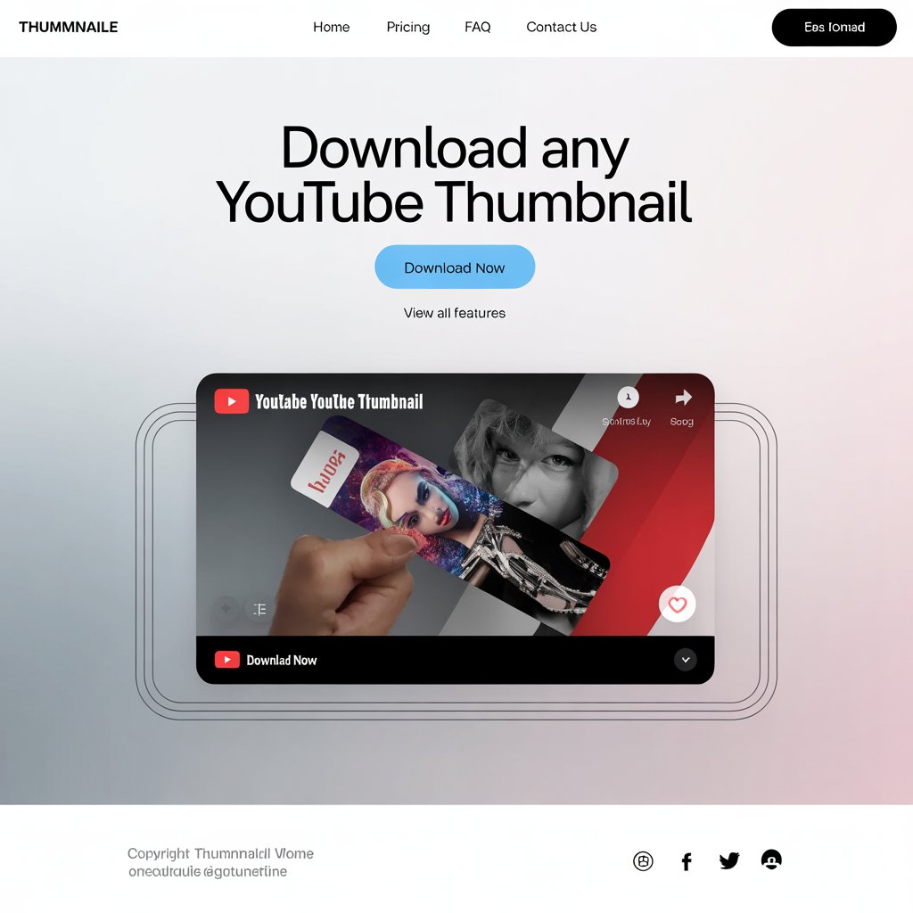
Using Low-Quality Images
A blurry or pixelated thumbnail can leave a bad impression, and viewers might skip your video altogether. If your image looks unprofessional, people might assume the video content is also low quality.
- Solution:
Always use high-resolution images. YouTube recommends thumbnails be 1280 x 720 pixels for the best results.
Choosing the Wrong Text Font
Not all fonts are created equal. A font that’s hard to read or doesn’t match the tone of your video can deter people from clicking. Many YouTubers make the mistake of using fancy fonts that look great but are difficult to read.
- Solution:
Use bold, clean fonts with high contrast against the background. Avoid overly decorative fonts, especially if they make the text hard to read on small screens.
Ignoring Branding
Without consistency, your thumbnails can look like they belong to different creators, which can confuse your audience. If you want to build a recognizable brand, your thumbnails should have a cohesive look.
- Solution:
Use the same fonts, color schemes, and logos across your thumbnails. This helps viewers immediately recognize your content when scrolling through YouTube.
Not Testing Your Thumbnails
It’s important to test different thumbnail designs to see which ones perform the best. A thumbnail that looks great to you might not resonate with your audience.
- Solution:
Experiment with different thumbnails for the same video and use YouTube’s analytics to track which one gets more clicks. Adjust your approach accordingly.
Conclusion
Your YouTube thumbnail is an important element of your content strategy, and avoiding common mistakes is key to ensuring your videos stand out. By keeping your design clean, using high-quality images, choosing the right fonts, and maintaining branding consistency, you can create thumbnails that attract more viewers and drive better engagement.